Mobile-ready · Free · No signup
Responsive Email Builder
Most email is read on a phone first. Build the layout once, let the columns stack and the images scale, and check the narrow width before you export a single line of HTML.
How the responsive part actually works
Nothing here depends on you writing a media query. The layout is built from tables with fluid widths, which is what survives an inbox, and the mobile behaviour is a setting on the blocks that need it.
- A columns block can be told to stack its columns on mobile, so a three-across row becomes three full-width rows on a phone.
- Text can carry a separate mobile font size, for headlines that are too large once the width halves.
- Images scale to the width of their container instead of forcing a horizontal scroll.
- Padding and container widths are set per block, so the reading measure stays sane at both ends.
Preview the phone width before you send
The editor switches between a desktop and a mobile screen width while you work, which is when stacking problems are cheap to fix. Preview mode drops the editing chrome so you are looking at the email rather than the tool.
Why tables and inline styles, not modern CSS
Email clients are not browsers. Several strip a <style> block entirely, some ignore flexbox and grid, and one of the most-used desktop clients renders HTML through a word processor engine. A responsive email therefore has to degrade into something sensible when its CSS is thrown away — a stack of fluid tables does; a flex row does not.
That is why the export looks the way it does. It is not legacy output; it is the shape that keeps working when a client refuses your stylesheet.
Still send yourself a test
A responsive builder removes the layout maths, not the need to check. Before a real campaign, send the exported HTML to yourself and open it in the clients your audience actually uses — that is the only honest way anyone can tell you an email renders correctly.
Templates built with stacking layouts
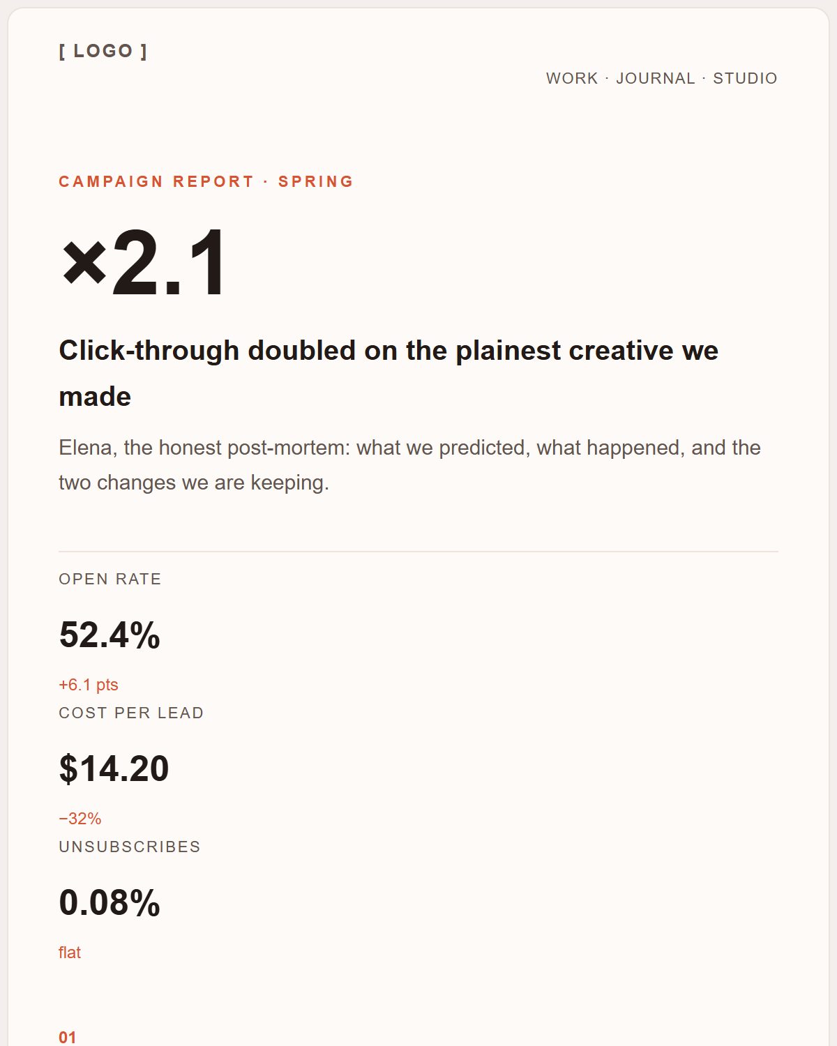
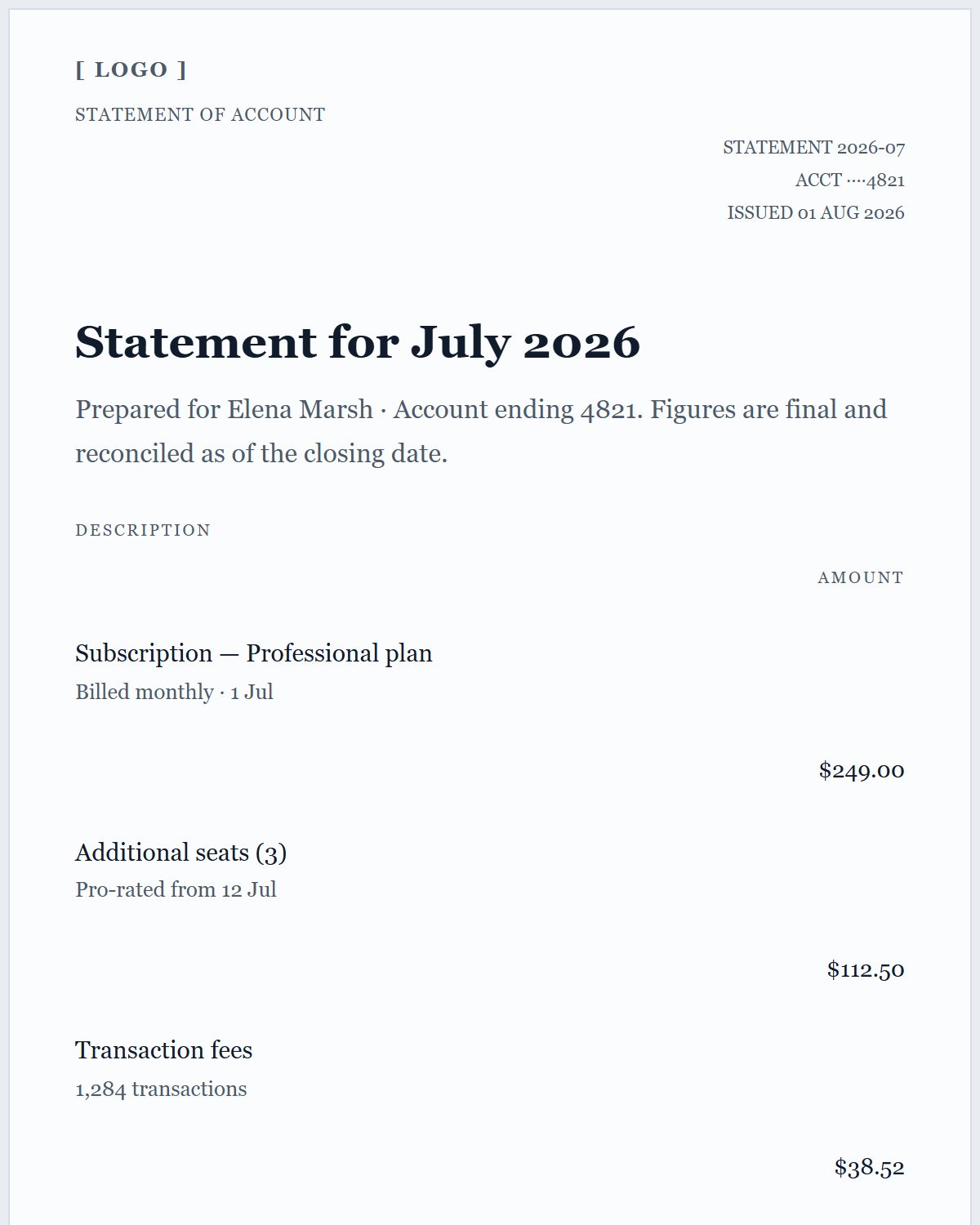
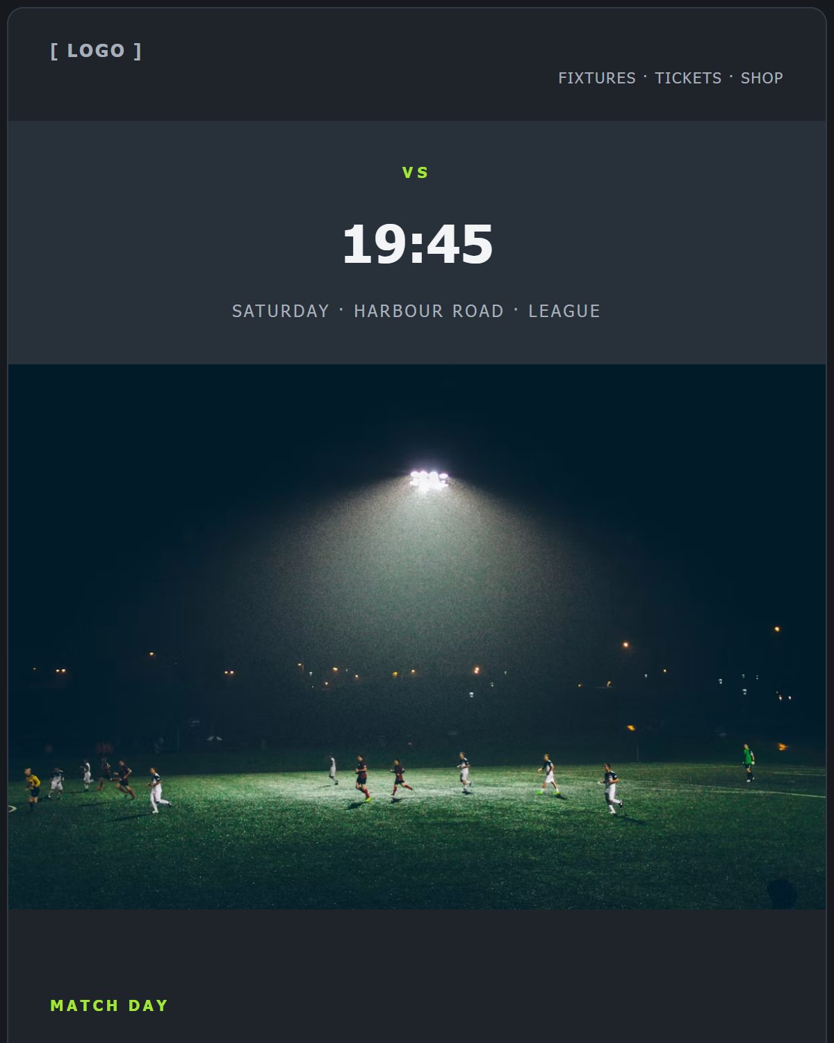
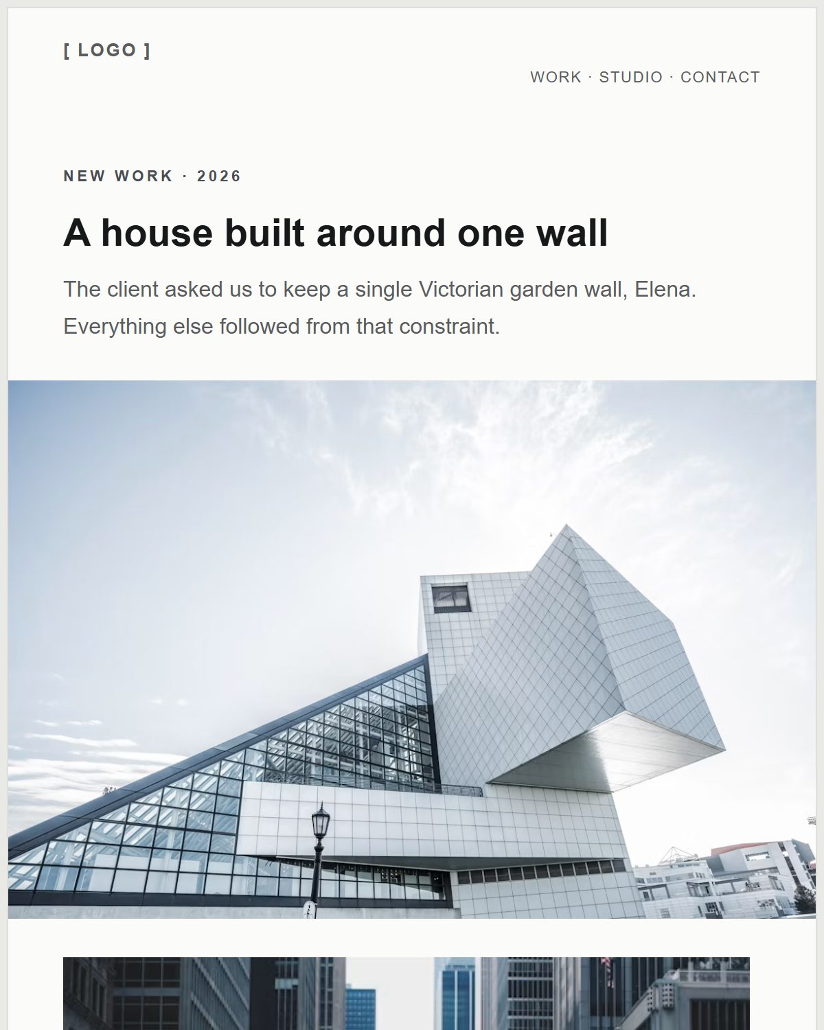
Multi-column rows that collapse to a single column on a phone — open one and try the mobile width.
Questions people ask about this
Do I have to write media queries?
No. Column stacking and mobile font sizes are settings on the blocks, and the underlying table layout is fluid, so the email adapts even where a client strips CSS.
Can I set a different font size for mobile?
Yes. Text blocks accept a separate mobile font size alongside the desktop one.
Which email clients does this support?
The export targets the table-based, inline-styled markup that mainstream clients including Gmail, Outlook and Apple Mail handle most predictably. Rendering differences between clients are a fact of email, so test your final send.